
FUTURE-READY EXCEL: From Basics to Brilliance - Session 3: Visualising the Information
-
Presenter: Renier Wessels and Michael van Schalkwyk
-
Level: Advanced
-
Study time: 1 Hour
-
Date: 21 July 2026
08:00 - 09:00
Write your awesome label here.
Course overview
Having transformed raw data into meaningful financial outputs, the next step is presenting that information in a way that is clear, professional, and easy for non-technical stakeholders to understand. In this third session of the Future-Ready Excel series, participants will learn how to convert analytical outputs into visually compelling reports and dashboards that communicate financial insights effectively.
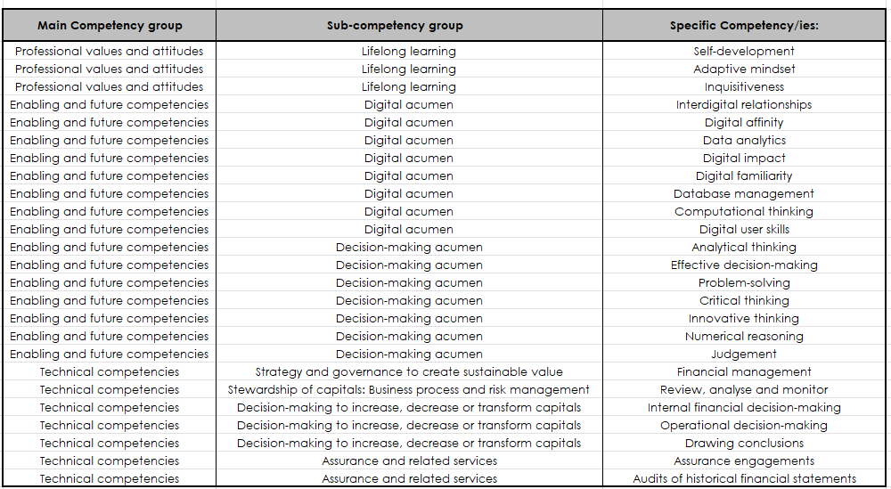
In completing this learning engagement, you will have developed the following professional competencies indicated in the green section below:
Building on the reports and datasets created in Session 2, this webinar will introduce participants to the principles of selecting the right charts for financial information, including when to use charts such as waterfall charts for profit and loss variances or combination charts for comparative analysis. Emphasis will be placed on clean, professional formatting practices that ensure charts remain clear and “accountant-proof,” avoiding unnecessary visual clutter while maintaining strong visual communication.
Participants will explore how to use PivotCharts together with slicers and timelines to create interactive reporting views, allowing users to analyse financial information dynamically by period, client, or cost centre. The session will also demonstrate how to build a simple but powerful dashboard on a single worksheet, incorporating key performance indicator (KPI) cards, sparklines, and multiple PivotCharts connected to the same slicers for unified interactivity.
In addition, participants will learn practical layout and presentation techniques—including sheet organisation, colour consistency, freezing panes, and protecting key reporting areas—to ensure that reports remain structured and user-friendly. The session will also cover the use of Conditional Formatting visuals, such as data bars, icon sets, and colour scales, to highlight trends and anomalies within financial tables.
By the end of this session, participants will understand how to transform financial analysis into clear, interactive dashboards and reports that communicate insights effectively to clients, management, and other stakeholders.
In completing this learning engagement, you will have developed the following professional competencies indicated in the green section below:
What's included?
-
1 Live event
-
1 Quiz
-
1 Certificate
Excel series
Link with SAICA Competency Framework

Copyright © CPD Campus (Pty) Ltd 2024